©

Date
Mar 2025
Client
Shop Alt
Industry
Fashion / Resale marketplace
Timeline
6 Months

Creative Strategy
Every decision flowed from the name.
ShopAlt — shop alternative — carried both the functional idea (this isn't mainstream fashion) and the philosophical one (there's another way to shop, and another way to think about what you already own). The positioning followed the same logic: not "buy secondhand clothes" but "sharing, not wasting" — reframing resale as something culturally native to India, not an imported trend.
That reframe unlocked the interface. If sharing was the point, selling couldn't be a separate flow tucked into a profile menu. We built a tier system to make selling feel like status, not admin — with unique branding elements per tier so climbing them had visual payoff. Selling components got scattered through the entire user journey instead of living in one place, and the menu itself became a two-sided drawer that promoted selling as often as buying. That single structural choice is why the product feels like a community instead of a marketplace with a resale filter bolted on.
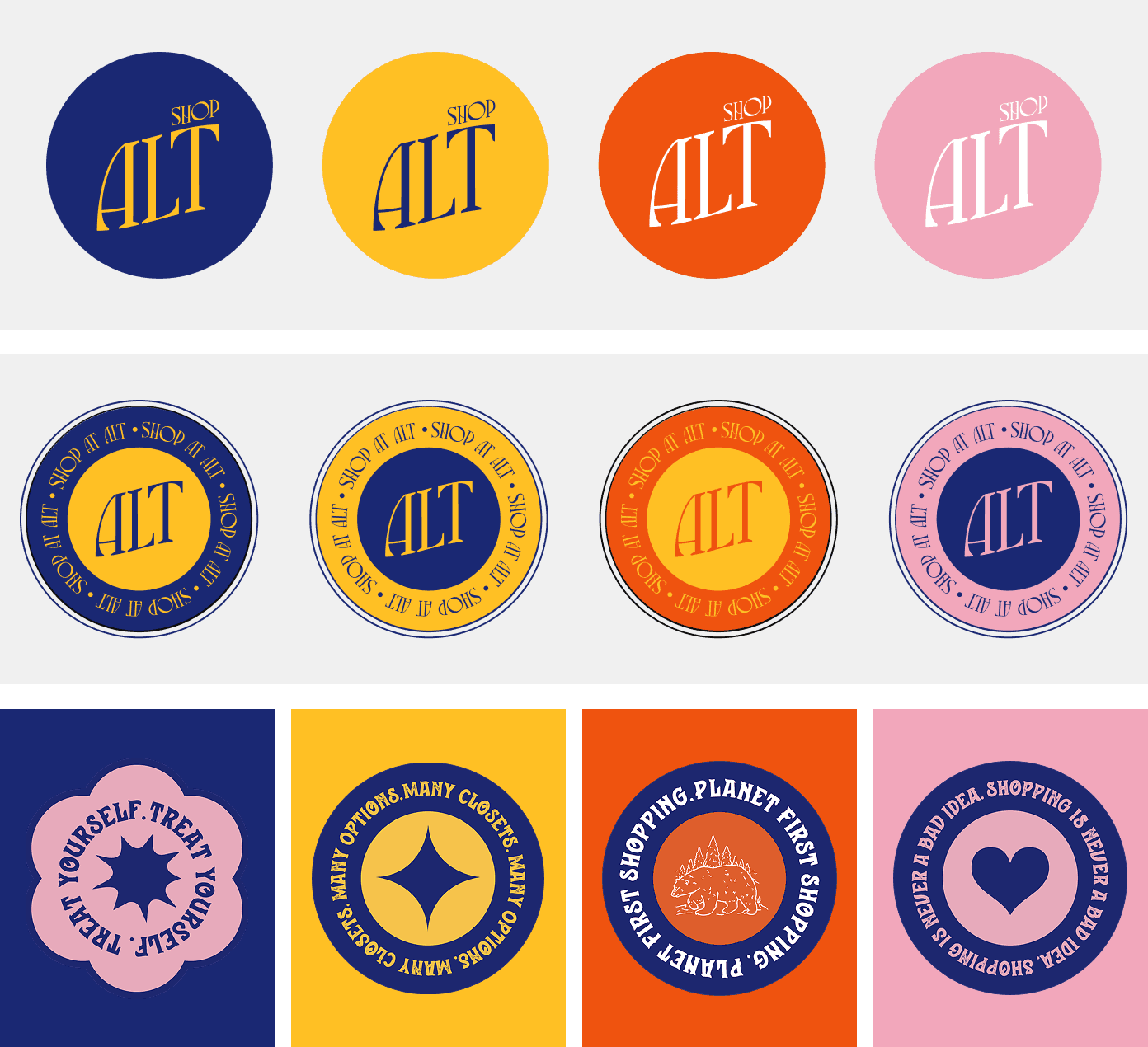
The visual system backed the same story: a poppy, wide-ranging colour palette instead of muted secondhand-store beige, badges and stickers built for visual memory, and a deliberate nod to vintage in the typography and iconography — because thrifting, done right, should feel like discovery, not compromise.

Creative Production
Full brand identity and naming.
Complete UI/UX system built mobile-first despite being conceived on desktop — product feed, seller profiles ("closets"), tiered selling badges, checkout flow, founder and community storytelling pages. Colour system spanning primary, secondary, success, and error states, plus a full icon and shape library built to keep the interface consistent as the catalogue scaled.


Results, not prophecies
The interface didn't just support the idea. It was the idea. Selling wasn't a feature ShopAlt added — it was the reason the layout looked the way it did.
Latest projects